 kfind-as-invoked-by-dolphin.jpg
A cursory look into KDE 4 file management: Dolphin beta
Windows has Explorer. Mac OS has Finder. GNOME has Nautilus. And KDE had, up to a number of months ago, Konqueror. Now, together with the up-and-coming KDE 4, a simple file manager named Dolphin takes on file management. So how does Dolphin stack up?
Very well, I must confess. File management is an everyday task — and most file managers get it right. What they usually don’t get right is the ability to do advanced things in an intuitive and discoverable way. Dolphin does — it successfully merges a basic file management interface with the most-requested advanced features, and in a non-obtrusive way.
Now, it’s been three weeks since I’ve been using Dolphin (the KDE 3 version) exclusively. As it turns out, Dolphin is quite versatile (if a bit more flickery than Konqueror 3) and faster as well. My only caveat was that I had to manually associate the inode/directory MIME type to get it to take over directory browsing.
But today, for the purposes of this review, it’s Dolphin 4 all the way.
How Dolphin starts up
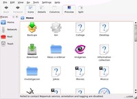
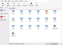
There’s nothing magical about Dolphin. Picture a Windows Explorer folder view (with the side panel, not the side tree). Picture a Nautilus browse folder. That’s how Dolphin looks like:
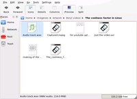
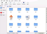
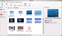
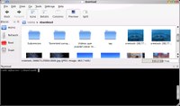
Of course, Dolphin has the ability to show previews like any other file manager. If you want it to show previews, you just hit the big Previews button, and presto:
Network transparency
Of course, Dolphin wouldn’t be part of KDE if it didn’t put to use the fantastic KIO technology. KIO is a way for applicatios to request and send data to local and remote file systems. Any application that uses KIO gets two big advantages:
- It becomes asynchronous. File operations never hang, because things happen upon notifications instead of waiting for them to happen.
- It gains the ability to access data anywhere in the world, through any popular protocol (HTTP, WebDAV, FTP, SFTP, SSH and much more).
And Dolphin is no exception. However, I didn’t test KIO remoting via SFTP on Dolphin 4, so you’re just gonna have to take my word for it. It’s okay — I use it every day in Dolphin 3.
It hangs. Hard. But, well, it’s a beta
Of course, it wouldn’t be a beta if it didn’t hang :-)
Let’s continue to explore what’s new in the (admittedly rather boring) file management world.
New features in Dolphin
After a quick restart, I started to poke around to find new features. And I did:
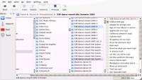
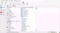
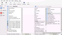
The column view
Not everyone has a huge stash of files at home (or at work). But for those of us who do, wading through millions of files is a daily event. So I was pleasantly surprised when I discovered that the Finder’s column view had made an appearance in Dolphin:
The Dolphin column view is a bit weird, in that at the beginning I didn’t know how to move around, but after discovering that the ENTER key opens a folder in a new right-hand column, and the left arrow key “returns” to the next-left column, I was set.
Of course, the preview feature works too, though it’s kind of futile at the default row/icon height of this view.
Split views
I abandoned Nautilus because of one reason — I constantly found myself mumbling “God damnit, I need to put this file in another folder, and I have to open the folder first”. Once I discovered Control+Shift+L in Konqueror (the keyboard shortcut that splits the view in two independent views), I was forever sold to KDE again.
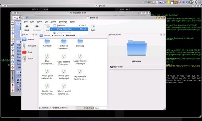
Dolphin takes it one step further, putting a large button in the toolbar for splitting the view by default. And putting a better, easier to access hotkey to activate the feature. Once you’re in a folder, and you discover you need to organize a file, you just hit the key shortcut, navigate to the new location, drag the file from the old pane into the new pane, and then hit the shortcut again. Presto — you’re back where you started and you can carry on. No need to go to the desktop. No need to open a separate folder view. No nothing, no nonsense. Results.
Panels
What used to be split views and sidebars in Konqueror makes a new appearance in Dolphin. I’ve focused on two of them that I bet will become favorites. The information panel, and the Konsole panel:
Both can be activated and deactivated (much like the rest of features in Dolphin) with easily accessible keyboard shortcuts.
The filter bar
A small filter bar has been sitting atop my Konqueror file manager for a few weeks now (courtesy, I guess, of one of the Kubuntu updates). I just don’t use it as much as I should — for some reason, actually picking the mouse up and clicking there, then typing, is annoying.
No more. In Dolphin, the filter bar shows up much like Firefox’s Find text feature, when you hit Ctrl+I. Type “jpg”, and you’ll be seeing exclusively all pictures. Anything you type prunes from the view all the files that don’t contain the string in their name.
Strigi desktop search and NEPOMUK technology
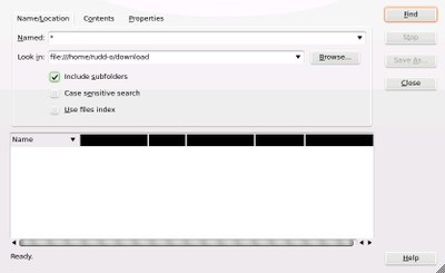
Regrettably, I couldn’t find any integration with the famed Strigi desktop search yet. I understand that, at some point, Dolphin will make use of both the NEPOMUK framework and the Strigi desktop search technology, but it appears not to be in there yet. Not just yet. Therefore, the Find file feature in Dolphin invokes good old KFind:
Option panels
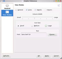
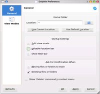
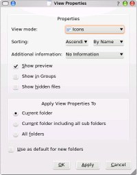
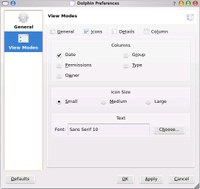
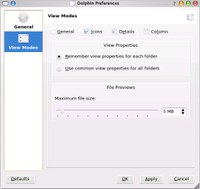
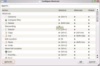
Here are a few option panels. It’s refreshing to see that Dolphin configuration has been made much more straightforward than Konqueror’s. I understand that Konqueror, due to its complexity, needs to expose many more options to the user than Dolphin — but this is precisely why I think Dolphin will be a winner for the desktop user.
Conclusion
Dolphin’s refreshing simplicity is a big win for KDE desktop users. I understand a large minority of the KDE user base may come to regret the decision to move to Dolphin as dictatorial, but they need to understand that Dolphin is the right call, for the sake of future KDE desktop adoption.
And it’s not like they can’t associate inode/directory back to Konqueror, can’t they?
 kfind-as-invoked-by-dolphin.jpg
 configuring-dolphin-view-modes-column-options.jpg
 dolphin-showing-previews-of-media-files.jpg
 the-filter-bar-is-a-welcome-addition-in-dolphin.jpg
 configuring-dolphin-general-prefs.jpg
 configuring-dolphin-view-properties.jpg
 split-views-make-rearranging-files-brutally-easy.jpg
 the-new-finder-like-column-view-in-dolphin.jpg
 dolphin-showing-the-home-folder.jpg
 configuring-dolphin-view-modes-detail-options.jpg
 the-traditional-konsole-terminal-panel.jpg
 dolphin-showing-the-root-directory-with-previews-enabled.jpg
 finding-a-file-in-a-big-directory-is-much-easier-thanks-to-the-dolphin-filter-bar.jpg
 dolphin-hung.jpg
 configuring-dolphin-view-modes.jpg
 configuring-dolphin-keyboard-shortcuts.jpg
 dolphin-showing-the-root-directory.jpg
 the-information-panel.jpg
 dolphins-column-view-makes-it-easier-to-navigate-deep-and-broad-directory-structures.jpg


